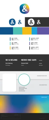
The team at & needed a new brand to reflect the fun, easy-going nature of their not-a-social-platform app. They had a concept: a sketch of a shaded ampersand. But, they weren’t sure how to bring it to life or how to unify their color ideas with it. That’s where I stepped in.
First, I built a vector version of the ampersand including a shift on the shading. As I worked, an inverse variation on the logo seemed to resonate. I combined the handdrawn & with an equally imperfect circle to create a logomark that was both anchored and impactful without being to rigid. My second step was to address the color palette. The team leaned toward a cool palette but wanted the mark to stand out among popular social media brands and apps. It was important that the mark could work as an app icon, logo, CTA and more. With that in mind, I combined their cool palette with a punchy golden yellow to create energy and contrast. Then – softened the colors into a gradient within the circle. This would be the primary mark, however I also flattened the design to a single-color look that could be used with any color in the palette to fit a variety of contexts down the road.
The & logo project is just one of many in which we emphasized the importance of designing for growth and expansion with an end result that can serve a variety of uses and work in a vast combination of contexts.


Leave a Reply